
案例详细说明
用高级和优雅定位内衣店/广州历新设计
2019-04-04
项目类别:零售空间 店铺设计 项目地点:四川 自贡 主设计师:彭建
设计说明:
内衣是一种与潮流与时尚结合很紧的物件,因此许多内衣专卖店都层出不穷,随着生活质量以及水平的越来越高,许多女性对内衣的追求也在不断提高。而想要在这么多内衣店中脱颖而出,首先就要有自己内衣店的装修风格,无论是店面橱窗,还是店里的试衣间陈列柜,小至灯具灯光,都是吸引消费者的一种存在。
我们结合MR L Miss C自身的品牌,给到内衣店的定位是高级和优雅,迎合当代女性的追求趋向,在现代快节奏的生活里,越来越多的女性从里而外都是优雅和知性,我们给店里的装修设计风格就是围绕着高级和优雅。能表现优雅高贵的颜色,非紫色莫属,从古至今,紫色都是神秘的,不凡的,也是优雅的体现。
Design Notes:
Underwear is a kind of thing that is tightly combined with the trend and fashion. Therefore, many underwear stores are emerging one after another. With the improvement of the quality of life and the level, many women's pursuit of underwear is also constantly improving. And if you want to stand out in so many underwear stores, you must first have the decoration style of your own underwear store. Whether it is the store window, the fitting room of the store, or the lighting of the lamps, it is a kind of presence that attracting consumers.
Combining MR L Miss C's own brand, we give the underwear store a high level and elegance, which caters to the trend of contemporary women. In modern fast-paced life, more and more women are elegant and intellectual from the inside to outside. So we decorate the store with a style that is centered around high grade and elegance. What color can express them, the answer is purple. From ancient times to now, the purple is mysterious, extraordinary, and elegant.
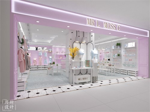
与其他店面设计不同的是,我们采用敞开的方式来代替玻璃橱窗,中间一面白色墙壁隔开,利用立裁人台来展示店内的新品或者热销产品。除此之外,我们还可以清晰地看见店内构造,消费者的角度也是一样的,一眼可以看见里边的衣物。
Different from other storefront designs, we use an open way to replace the glass window, separated by a white wall in the middle, and use the mannequin to display new or hot products in the store. In addition, we can clearly see the structure inside the store, the consumer's angle is the same, you can see the clothes inside.
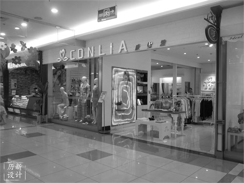
这是我们未进行改造前的店铺形象,可以看出现场也是没有什么亮点,装修风格较普通。
This is the image of the store before we remodeled. It can be seen that there is no bright spot on the scene, and the decoration style is more common.
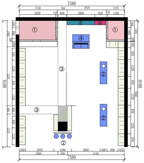
①试衣间 Fitting room ②中导展示区 Central display area
③防火卷闸门 Fireproof Rolling Gate ④收银台 Checkout counter
⑤形象墙 Image Wall ⑥精品柜 Boutique cabinet
根据现场的空间结构,我们制定了平面布置图,贴近墙壁两边的是四季柜和内衣柜。
According to the space structure of the site, we have made a floor plan, close to the wall is the four seasons cabinet and the underwear wardrobe.
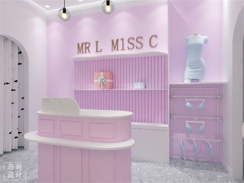
这是店里收银台的设计,我们采用紫色作为背景墙,一角落用于展示成套的衣物,可以放置新品或者热销产品,旁边是设置成折叠一样的墙壁,使得总体没有那么单调。收银台是粉紫色的,跳色的效果是不会让人产生审美疲劳,淡粉色与淡紫色也是一个很好的搭配。
This is the design of the checkout counter in the store. We use purple as the background wall. One corner is used to display the set of clothes. It can be used to place new products or hot-selling products. Next to the wall is set to fold, making the overall less monotonous. The checkout counter is pinkish purple, and the effect of color is not to cause aesthetic fatigue. Light pink and lavender are also a good match.
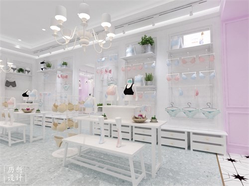
对店里我们也是采用了北欧的简约风格。这是内衣柜的设计,白色背景墙,内衣整齐地正挂在柜子里,底下我们用的是白色的抽屉式柜子。内衣柜上方的装饰除了品牌的发光板,也多了一些绿植,在正对面的置物架是是桌子形式,上方摆放着的是鞋类和其他衣帽。我们可以看到灯具是较高级的白色吊灯,与优雅很相称。
For the store we also adopted the Nordic minimalist style. This is the design of the underwear wardrobe, the background wall is white, the underwear is neatly hanging in the cabinet, and we use the white drawer cabinet underneath. In addition to the brand's illuminating panels, the interior of the wardrobe is also decorated with some green plants. The shelves on the opposite side are in the form of tables, and the tops are shoes and other coats. We can see that the Lamp is a higher-grade white chandelier, which is very commensurate with elegance.
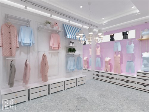
白色和墙壁和紫色的墙壁相互交融,使整体不会死板,大件衣物正挂的陈列柜也是比较简约的,但都能很好地体现衣物的细节。恰好明亮的灯光打在整个环境里,使人感到舒适和产生购买的欲望。
The white walls and the purple walls blend together, so that the whole will not be rigid, and the large display cabinets are relatively simple, but they can reflect the details of the clothes. Bright lights are used throughout the environment to make people feel comfortable and have a desire to buy.

喜欢的朋友可以关注一下,了解更多哦~
If you like us, please pay attention to know more about us~
