![]()
案例详细说明
金属与少女粉的碰撞/广州历新设计
2019-04-03
项目类别:商业空间 商场 项目地点:广东 惠州 主设计师:彭建
设计说明:
粉色是娇柔可爱的代表,就像少女的美梦一样洋溢着青春活泼,也充斥着清新活力,同时可以带来桃花运以及恋爱运。客户原来的品牌形象店是位于惠州知名的商场里,总体以粉色为主,但现下消费水平的不断提升,人们对新鲜事物的认知也不断升级,所以这种简单的粉色也不能满足人们审美的需求了。
于是我们开始定位整个店铺的风格。要想做到高级的粉色,就要取决于其色调和材质。丝绒材质可以提升粉色以及空间的质感。透明的粉色材质也可以在视觉上达到一种戏剧性,节制的色调为硬朗的空间增添轻柔气质。
可以让浪漫的氛围变得更加优雅的元素,非金属莫属了。粉色与白色的空间点缀上金色线条,几何形态的简单组合就变得梦幻与优雅,无论是黄铜色还是玫瑰金,都与粉色互相融合,相得益彰,金属与少女粉的碰撞结合也是完美的一个构造。
Design Notes:
Pink is delicate and lovely, just like a girl's dream, full of youthful and lively, full of fresh vitality, and can bring luck in love . The customer's original brand image store is located in a well-known shopping mall in Huizhou. The overall color is mainly pink, but the current consumption level is constantly improving, people's awareness of new things is constantly upgrading, so this simple pink can not satisfy people's aesthetics.
So we started to locate the style of the entire store. To achieve advanced pink, it depends on its color and material. The velvet material enhances the texture of pink and space. The transparent pink material can also be visually dramatic, and the temperate tones add a soft temperament to the tough space.
The element that makes the romantic atmosphere more elegant is metal. The combination of pink and white is embellished with gold lines, making the simple combination of geometry become dreamy and elegant. Whether it is brass or rose gold, it blends with pink and complements each other. The collision of metal and girl powder is also perfect.
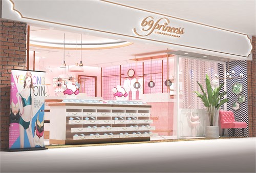
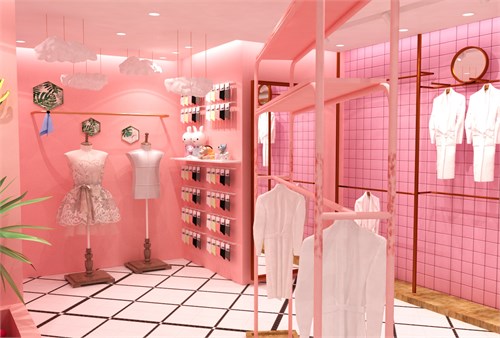
这是整个店面的效果图。顶端是白色背景加上金属边框的点缀,店铺logo在正中间,左边一张海报点亮主题,右边是可爱流行的装饰物和绿植,梦幻中不失一些生机。我们可以看见店铺里分层制作的置物架,美观又节省空间,总体是粉色与金属为主,也符合“公主”这一店名。
This is the rendering of the entire storefront. The top is a white background with a metal border embellishment, the shop logo is in the middle, a poster on the left lights up the theme, and on the right is a cute and popular decoration and green plant, without losing some vitality in the dream. We can see the shelves in the store layered, beautiful and space-saving, the overall is mainly pink and metal, also in line with the "princess" store name.
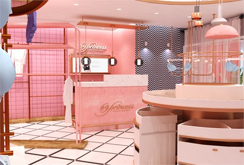
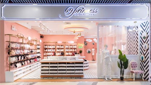
黑白格子的地砖不失为一个亮眼之处,时尚简约。墙壁有粉色格子的,有黑白波纹的,这一点是让人们不容易产生视觉疲劳,二者结合可以打造一个别致的空间结构。我们还可以看到圆形的置物架,上下都设置了很多格子,这些可以用来放不同类型的商品,粉色半圆形的灯具可爱独特,总体都是互相呼应。
The black and white plaid floor tiles are a bright spot, sleek and simple. The walls are pink and black and white, which is so that people are not prone to visual fatigue. The combination of the two can create a unique spatial structure. We can also see the round racks, with a lot of grids on the top and bottom. These can be used to put different types of goods. The pink semi-circular lamps are cute and unique, and they all echo each other.
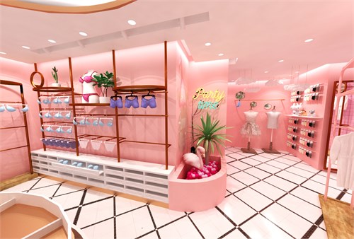
金属制成的置物架贴近墙壁,衣物可以正挂着,更好展示出来。我们可以看见左边衣架下方,是白色木板制成的柜子,这样可以更好地陈列货物,整齐不杂乱。
The metal racks are close to the wall, and the clothes can be hung to better display. We can see the bottom of the hanger on the left side, which is a cabinet made of white wood, which can better display the goods, neat and messy.
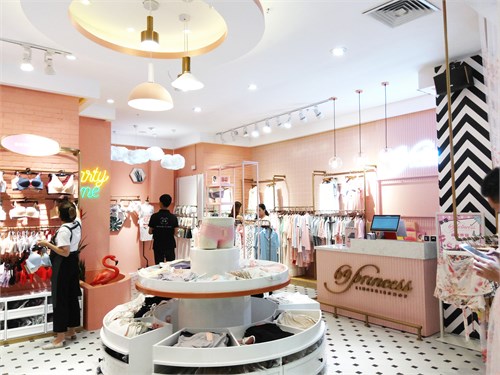
这是完工后的现场图,灯光明亮,现场氛围十分梦幻和清新。
This is the scene map after the completion, the lighting is bright, the atmosphere is very dreamy and fresh.
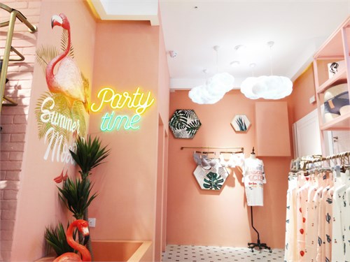
这些都是店里的部分角落,实际与效果图也没有多大出入,现场看来还是很符合定位的风格,少女粉和金属的结合还是很有效地提升氛围和档次。
These are some corners of the store, the actual and renderings are not much different, the scene seems to be very consistent with the positioning style, the combination of girl powder and metal is still very effective to enhance the atmosphere and grade.
喜欢的朋友可以关注一下,了解更多哦~
If you like us, please pay attention to know more about us~