案例详细说明
时装概念店设计
2013-06-07
项目类别:零售空间 店铺设计 项目地点:海外 其他 主设计师:刘迪功DICKENSLIU
A design of boutique i made for my friend when i was a fresh in university. During that period, i did not know what is design, all of the concept i just created according to the natural feeling.
在刚进入大学的时候为朋友设计的服装小店,当时对室内设计还没有形成概念,完全凭一种潜在的设计意识和感觉来进行设计,虽然有很多地方不完善,但是日后回过头来看看觉得还挺有意思。

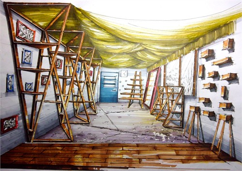
For this one i want to prove that i prefer to adopt the wooden materials in internal space because of the wood that is one of best stuffs from the nature.The instruction of the carriers looks like a tripod, showing a steady itself, but broke the stuffy feeling of the whole interior space. While it is very suitable that using the cheaper materials like linen or canvas decorate as celling covered with several bulbs, the light will be mild cause of its filter. What's more the organic elements and the waved celling form set against the harsher lines of the original architecture.
在设计中将货架设计成正负三棱锥行,目地有二,其一是必须在有限的空间中最合理最大化的使用空间,因为作为商用空间,寸土寸金。其二,为了丰富空间效果,通过几何形态的改变打破固有呆板的造型,丰富空间形态。而天花的装饰为了节约资金同时效果最大化,我采用了布料的大面积使用,同时将灯光系统预留至其中,这样光线投过薄布的过滤显得更为柔和舒适。与此同时,原有建筑和货架的硬朗线条也随着这些柔性的元素也削弱。
