案例详细说明
GREAT Food Hall
2013-01-22
项目类别:零售空间 店铺设计 项目地点:香港 香港 主设计师:Mark Panckhurst 参与设计师:Mike Atkin, Mark Panckhurst, Robert Weller 设计单位:HEAD Architecture and Design Limited 项目面积:15,000 square feet 业主:A.S. Watson Co. Ltd. 摄影师:HEAD Architect/ Kris Vervaeke
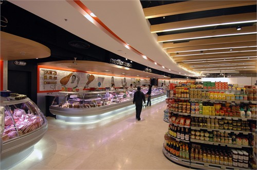
Opened in 2000, the Great Foodhall has gradually changed from being a large dining-in food court toward being a gourmet shopping supermarket. Since no overall strategy had been considered during this change, many aspects of the design had become inconsistent or outdated. No consideration had been made of the overall look and feel of the store. The planning of the store did not allow for a clear customer flow.
Our new design rationalised the overall planning of the store, created an updated and consistent visual identity and enabled many new concession counters to be added. The construction was done in phases to ensure continuous operation during the refurbishment.
With so many entrances to the basement store a set of clearly branded panels and portals were created to signify the extent and location the new foodhall. However with branding space at ground floor level in short supply high-impact seemed the best option.
The new entrances not only had to work in basement valet parking areas but look good next to high grade beauty stores and the existing mall fittings in Pacific Place.
The updated visual identity was carefully formulated by HEAD in association with Kactus Design and photographer Kris Vervaeke.


