案例详细说明
曼聯全體驗 Manchester United Experience
2012-07-27
项目类别:零售空间 专卖店设计 项目地点:澳门 澳门 主设计师:Mike Atkin 参与设计师:MET Studio 设计单位:HEAD Architecture and Design Limited 项目面积:11000 sqft 摄影师:Graham Uden
Award
IC Award International interior Design 2009
Gold Award @ Exhibition Category
The principal circulation decisions were as follows:
1. a single entry point into the Mega store with access to the Experience from inside the Mega store
2. circulation at Mega store level that takes you around the store and brings you back to the POS for payment prior to exiting
3. Experience ticket sales within the store and connected to the POS area for simplicity
4. controlled vertical circulation up to the Experience from the store once the visitor has bought a ticket
5. circulation at Experience level that allows a logical return to the rear of the Mega
store level once the Experience has been completed so that the visitor can make
retail purchases and exit
6. one ‘down only’ escalator is to be installed as a way of avoiding short circuiting of
vertical circulation
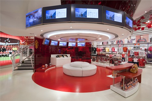
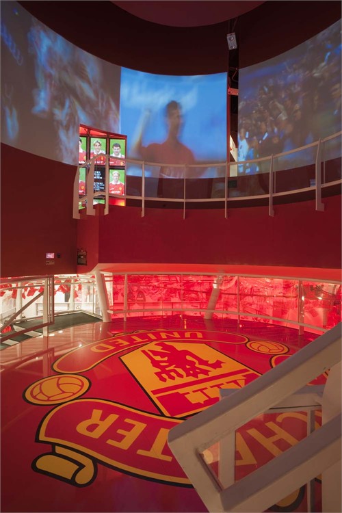
Due to high ceiling heights, it was possible for a circular hole to be cut in the Experience floor
and a circular mezzanine level to be built between the Mega store and Experience in the
centre of the store.
The Opus – a gigantic limited edition Manchester United book - will be displayed under this
mezzanine and there will be retail and video images around to entice the shopper to visit the
interactive area upstairs.
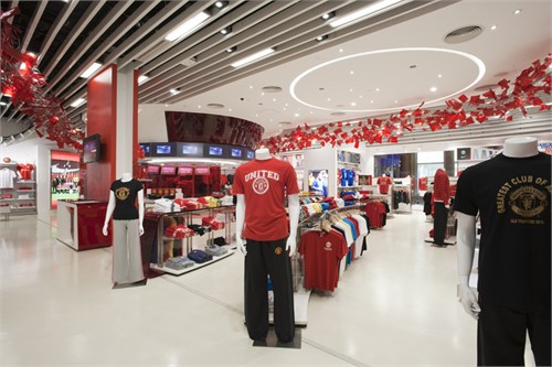
The layout and concept for the retail store was designed to be clean, simple and flexible. A
curved custom low shelving unit was designed for the front area of the store and then the
Nike retail system furniture was used for the remainder of the display areas. Floor units are
kept to a datum to allow an uninterrupted view to the back of the store. The wall units were
capped at 2400mm with easily interchangeable super-graphics of players and other
promotional images.
Eye-level advertising, team group shots, video images of players and mannequins were all
designed to be life size for continuity and so that the customer could pose with their favourite
players. Names of team players throughout the history of the club are used on walls as
backdrops to the retail bays.
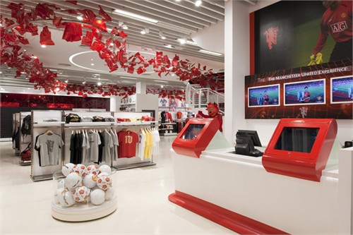
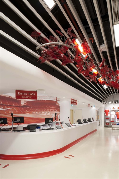
The POS area has a similar curved shape and is sculpted in white Corian. Shirt printing is
also carried out here and tickets for the interactive museum are on sale. Similar to the Old
Trafford mega store, a red tinted image of old Trafford is used across the back wall.
The colour scheme uses with the red and white of MUFC with a white floor and white ceiling.
A “Red Devil” tail was custom designed to hang from the ceiling on invisible fixings. This tail
would guide customers around the store and back to the POS and exit but also use the
available ceiling height and be an exciting team related visual element.
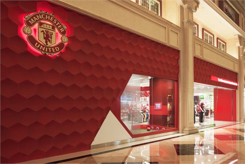
The exterior is treated with a red concave hexagonal formwork with one large highlevel club
crest and The Manchester United Experience lightbox. The long elevation is naturally broken
down into three parts by the generic columns of The Venetian. One allows a traditional look
through with window mannequins, the second has a large red 3M club logo image with some
player graphics and the middle section has an LED backlit football display to allow full height
wall display units on the interior.
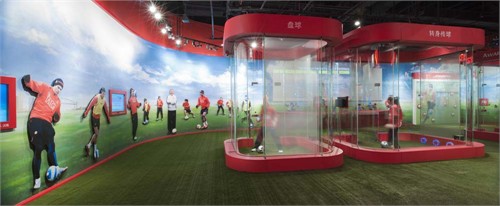
The entrance is open and inviting, allowing a rich view into the store. A single training pod
was introduced to the left of the entrance to allow customers to get an impression of what is
available upstairs and also to create dynamisms within the shop front.
The entrance is shared for the Mega store and Experience. It is a general retail belief that
shoppers turn to their right upon entering a store. Therefore the shopper will navigate the
store anti-clockwise and arrive at the POS and replica shirt area, pay for their goods and exit.
The POS area also sells tickets for the Experience.
They can then exit the Mega store or go around the Mega store with the rest of the shoppers
as described above, before paying and exiting.
The cylindrical semi-translucent mezzanine level was seen as a holding space and appetizer
for the Experience above. As a transition area from the retail floor to the exhibition floor the
Rotunda must be capable of providing:
1. A welcome and very brief introduction to the exhibition
2. A teaser for things to come
3. A visual link from ground to first floor and enticer
4. Brand enhancement
However, we must be careful that the Rotunda has a differentiated function from the Club
intro to follow - it must not steal the thunder from the things to come.
Once the pre-show has finished, visitors will take a further set of steps up to the Experience.
They will then go around the Experience in a clockwise fashion and return to the Mega store
floor by escalator, arriving towards the rear of the store. They will then pass through the
Mega store, shopping if they wish, before paying for any selected goods and exiting the store.
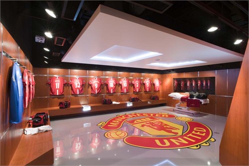
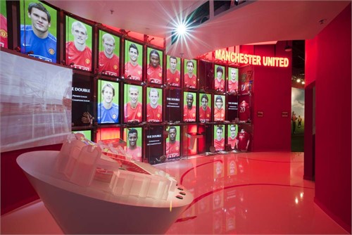
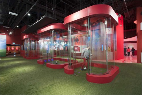
當遊人來到了位於澳門威尼斯人酒店內全新的「曼聯全體驗」,旗艦店入口首先展示的是這隊由1878年開始, 及演變成今日總值英鎊10億8千萬的傳奇足球隊的不凡歷史,并在孤形的牆壁上的屏幕中不斷地上演球隊一幕幕在球場上的精彩賽事。在「練習場」(亦佔了當中最大面積的空間)包括了舖了人造草皮的“球場”,及五個獨立而互動的迷你練習室; 參加者先登記數據, 便可以和朋友在此一比球技高下。
